Short Stories Award

A little while ago Gerard Hall, Editor at Scene Alba Magazine, invited me to create an identity for the magazine’s new SAM LGBTQ Short Stories Award, that they’ve launched this year.
Although the brief from Gerard was left fairly open, he told me that there were themes that the magazine wanted to convey through the branding. Chiefly that the Short Stories Award were open to all writers who identified themselves as being part of the LGBTQ community, and who were a resident in Scotland.
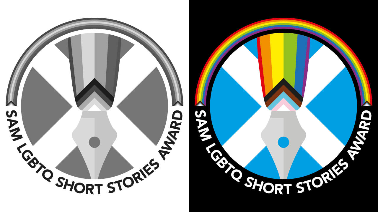
My initial idea of a pencil combined with the Scottish saltire felt more drawing rather than writing. So changing the implement to a fountain pen made the logo feel more relevant. As a side note, I should mention that I have friends who still use ink pens to write their correspondence with, so they’re not museum pieces just yet.
For the barrel of the pen I added Daniel Quasar’s Progress Pride flag, and this provided a very pleasing visual link with the Scottish saltire, behind it, through the strong 45º diagonals.
To balance the typography around the bottom of the logo, I added another LGBTQ+ Progress Pride rainbow around the top.
As with all the branding identities that I develop and create for clients, I made sure that it was able to be replicated in a single colour, greyscale, full colour, and works on both light and dark backgrounds. In addition I created animated versions of the branding that could be incorporated into social media post and stories.
For full details about for these awards head to the SAM LGBTQ Short Stories Award page of the Scene Alba website for more information.